Each season the team at the Pantone Color Institute creates the Pantone Fashion Color Trend Report; a colour overview highlighting the top colours fashion designers showing at London Fashion Week will be featuring in their collections for the upcoming season. With colour on the catwalk a key indicator of the colour stories we can expect to see showing up across all areas of design, the Pantone Fashion Color Trend Report is your easily accessible guide to the season’s most important colour trends.
![]()
FASHION COLOR TREND REPORT
London Fashion Week Spring/Summer 2019
EXPERIMENTATION CHARACTERISES UNINHIBITED SEASONAL COLOUR DIRECTION

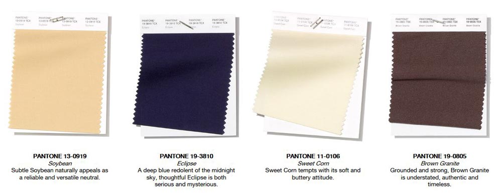
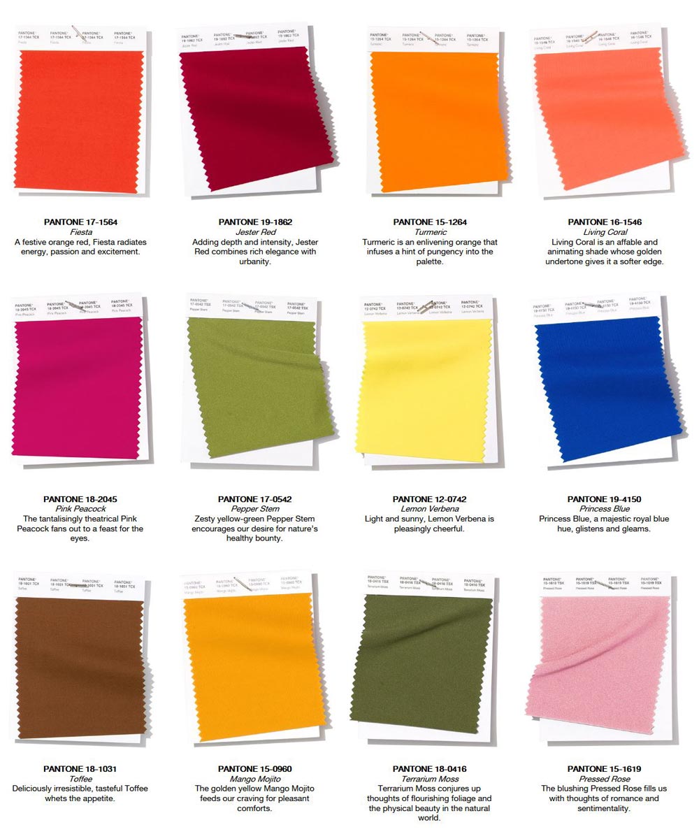
Images extracted with permission from PANTONEVIEW Colour Planner Spring/Summer 2019. See all of our PANTONEVIEW Colour Planner trend forecasts.
Spring/Summer 2019 reflects our desire to embolden ourselves as we face the future; turning to colours and colour stories that provide confidence and lift our spirits; embracing a colour and design direction filled with creative and unexpected combinations. This season’s report features the top 12 stand out colours, as well as current takes on four classic neutrals.
This new mindset underscores a desire for a joyful juxtaposition of colour that transcends seasonality and joins together high fashion and street style. Dynamic and vibrant without being overpowering, highlighted shades for both men’s and women’s fashion illustrate our desire for authentic colour expression and at the same time a continuing need for relatable, accessible design.
About the Spring/Summer 2019 LFW Color Palette:
Energizing hues supported by a range of dependable classics defines the spring/summer 2019 colour story for men’s and women’s fashion.
About the Spring/Summer 2019 Neutrals:
There will always be a need for structure in everyday fashion. This season’s classics work well on their own, but also serve as a foundation for distinctive colour contrasts.