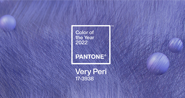
Pantone Color of the Year 2022 / palette exploration

We have created four unique color palettes featuring PANTONE 17-3938 Very Peri to help you bring this year’s special shade into your designs. Each palette conveys a different mood, illustrating PANTONE 17-3938 Very Peri’s versatility. Each palette additionally features 3 suggested color combinations integrating PANTONE 17-3938 Very Peri.
Pantone Connect, a digital color platform for designers available on web, via mobile apps, and as an extension for Adobe® Creative Cloud®, includes four different pre-loaded color palettes featuring Very Peri. These Pantone Color of the Year 2022 themed palettes, along with every other Pantone Color, are available to share, save, and use in your design files within Adobe Photoshop®, Illustrator®, and InDesign®. With a free Pantone Connect account, designers can access many other time-saving features to find inspirational colors, save color palettes, and design with achievable Pantone Color.
VISIT PANTONE CONNECT ON THE WEB TO GET STARTED TODAY


-
-
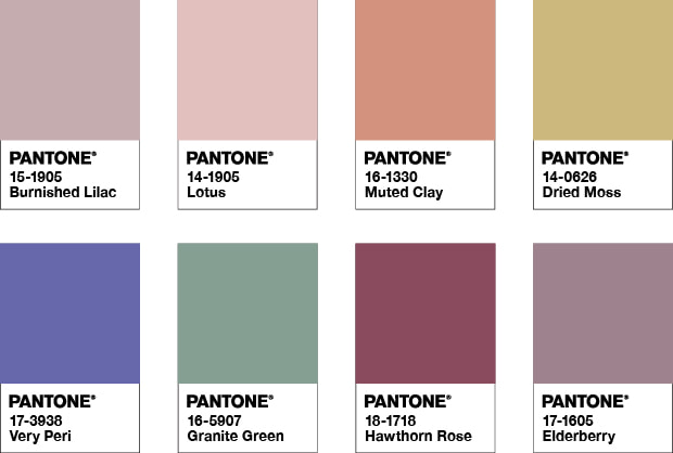
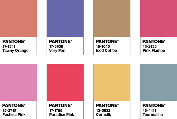
Balancing Act
Balancing Act is a complementary palette of color whose natural balance of warm and cool tones support and enhance one other. The brilliance of PANTONE 17-3938 Very Peri is intensified within this artfully calibrated palette, injecting a feeling of liveliness and visual vibration.
Color Harmonies

-
-
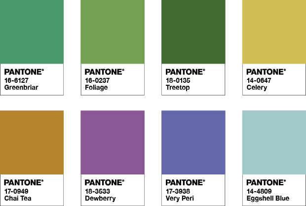
Wellspring
A holistic and harmonious blend of nature infused shades, Wellspring highlights the compatibility of the greens with good natured PANTONE 17-3938 Very Peri, and the health-giving properties of these deliciously subtle and nourishing hues.
Color Harmonies

-
-
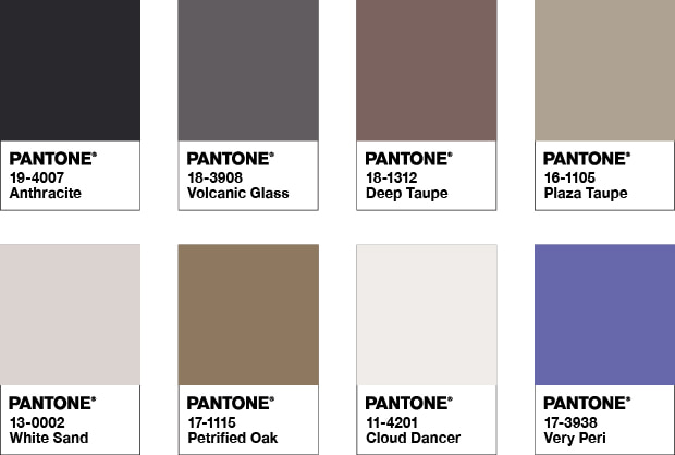
The Star of the Show
The dynamic presence of PANTONE 17-3938 Very Peri comes through in The Star of the Show, as we surround this happiest and warmest of all the blue hues with a palette of classics and neutrals whose essence of elegance and understated stylishness convey a message of timeless sophistication.
Color Harmonies

-
-
Amusements
Amusements, a joyous and whimsical color story of irrepressible fun and spontaneity is amplified by the carefree confidence and joyful attitude of PANTONE 17-3938 Very Peri, a twinkling blue hue whose playfulness
emboldens uninhibited expression and experimentation.Color Harmonies